
After 12 years of faithful service, the TrackJS interface was starting to show its age. Not that it wasn’t working—it was still doing exactly what our customers needed it to do. But when you’re staring at Bootstrap styles from 2012 and a version of LESS that might be officially defunct, it’s probably time for a refresh.
We Didn’t Break What Wasn’t Broken
The most important thing we want you to know about our new UI: if you knew how to use TrackJS yesterday, you still know how to use it today. It’s called “not moving the cheese,” and it was our number one priority throughout the redesign.
We’ve all logged into a familiar app only to be greeted by that dreaded modal: “We’ve got a new design!” followed by complete confusion about where everything went. We refused to put you through that experience. Every feature works exactly the same way it did before—it just looks a whole lot better.
What Actually Changed
A Modern Foundation
We replaced our decade-old Bootstrap styles with modern CSS built on Flexbox. No more nested <div class="row"><div class="col-md-8"> markup. No more floats and clearfix hacks. Just clean, modern styling that actually makes sense.
We also modernized our build process, swapping out ancient build configuration and moving from LESS to Sass. The result? Faster builds and CSS files that are half the size of what we had before.
Consistency Across the Board
For the first time in TrackJS history, we styled the entire application at once. Previously, features were added and styled incrementally over the years, creating an inconsistent patchwork of different design approaches. Some screens were designed by professionals, others by us developers (you can probably guess which was which).
Our designer brought a systematic approach to spacing, colors, and layouts. If there’s a little bit of padding, it’s 8 pixels. A bit more? 16 pixels. Even more? 24 pixels. This consistency shows throughout the entire application.
Better Visual Hierarchy
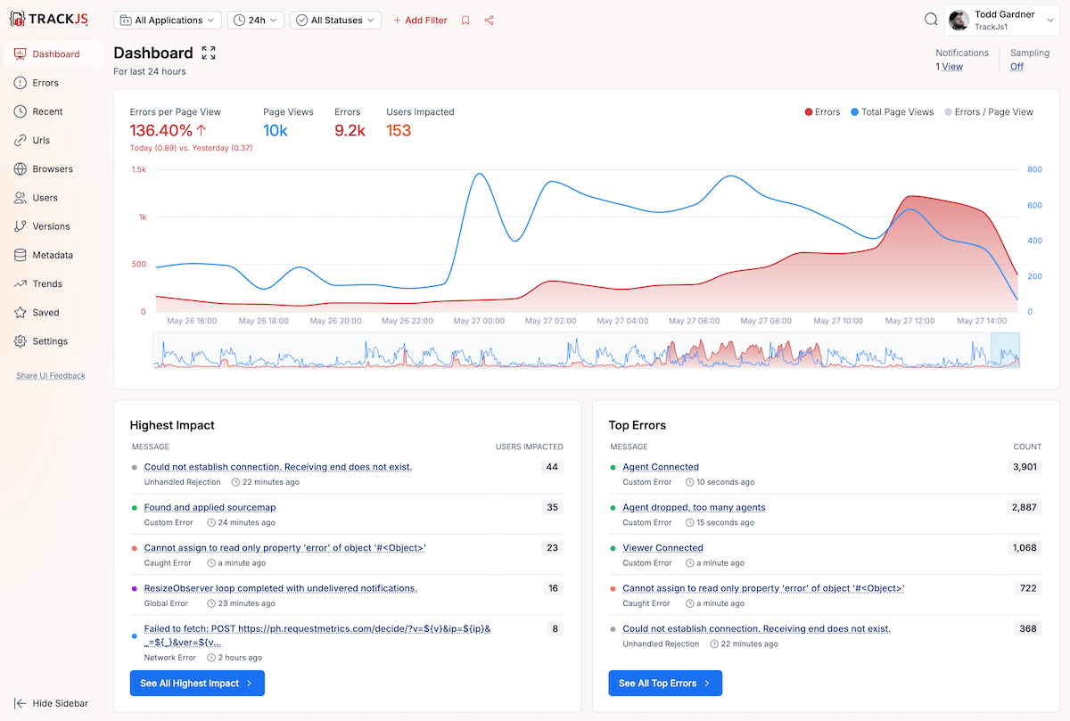
We increased contrast and improved the separation between different elements on each page. The goal was to let your error data shine while keeping the chrome minimal. You’re here to solve problems, not admire our UI.
What We Learned (The Hard Way)
The most unexpected part of this project? The overwhelming demand for dark mode. We’re old-school developers who don’t use dark mode for anything, so we honestly didn’t see this coming. But the feedback was deafening: “The new UI looks great, but where’s dark mode?”
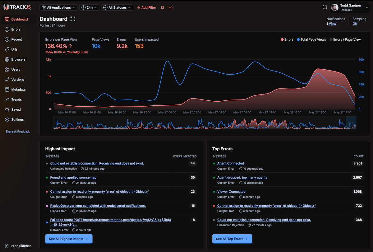
So that became our first post-launch feature. And the gratitude from users once we shipped it was incredible—not just “thanks for adding this” but “thank goodness you did this.” Apparently, those new Mac displays can get blindingly bright, and our light theme was burning some retinas.
Technical Debt Cleanup
One of the hidden benefits of this redesign was the chance to clean up 12+ years of accumulated technical debt. Our CSS had layers upon layers of styles from different eras—like archaeological strata in rock formations. We literally threw it all away and started fresh.
The codebase has always been designed for simplicity, which made this project surprisingly pleasant to work on. We kept the hard technical decisions simple, avoided over-engineering, and focused on what actually needed to be done. Usually the “dumb” solution really is the best solution.
Built to Last
This modernization positions us well for future features. We now have a consistent design language and reusable components that make adding new functionality much easier. Plus, when new features ship in a modern-looking interface, they get their due—users notice and appreciate the improvements instead of dismissing them as “still looking old.”
Your Feedback Made It Better
We built a low-friction feedback system right into the new UI, and you used it. A lot. Most feedback was positive (thank you!), but you also helped us identify areas where we could improve contrast and make elements more distinct.
Ya’ll did a fantastic job on the redesign! It’s really clean, less cluttered, icons & typography are properly sized, good spacing. But it’s all still familiar. Love it. Well done
This reinforced something we’ve learned over the years: if you want customer feedback, you have to make it incredibly easy to give. Email addresses aren’t enough—people need to be able to speak up without leaving your app.
Same Reliable Error Tracking, Better Looking
The new UI rolled out to all TrackJS customers last week. You’ll notice the visual improvements immediately, but more importantly, you won’t notice any disruption to your workflow. Your dashboards, filters, error details, and all the features you rely on work exactly the same way they always have.
We built TrackJS to solve real problems for real developers, and that hasn’t changed. We just made it a lot nicer to look at while you’re solving those problems.
Want to see the new UI in action? Log into your TrackJS dashboard and take a look around. And if you’re not a TrackJS customer yet, start your free trial to experience modern error tracking with a modern interface.
